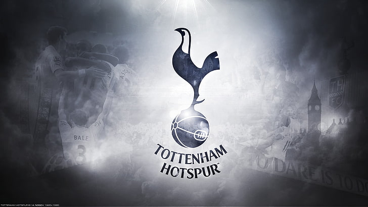
TOTTENHAM have released a new club badge which features a major change – but fans say it “seems pointless.”
Spurs’ current crest features the clean look of a cockerel standing on a football.
Underneath the emblem are the words ‘Tottenham Hotspur’.
And supporters have been used to the simplistic style ever since the badge was marginally scaled back in 2013.
However, a new badge has now been released.
And it has removed the words from under the football to make for an even more basic look.
An official statement confirmed: “We have removed the curved ‘Tottenham Hotspur’ text from beneath the cockerel.
“This enables us to increase its scale across different environments and stand proud as a true icon for the Club.”
But there has been a mixed reception towards the new look from fans.
One said: “Seems pointless.”
FOOTBALL FREE BETS AND SIGN UP DEALS
Another declared: “Would’ve got rid of the chicken and ball.”
One noted: “A big difference.”
Another added: “Wow great change.”
Founded in 1882, Spurs only started wearing the cockerel on their badge in 1921.
It was a special addition to Tottenham’s kit for their FA Cup final against Wolves.
Spurs won the match – which took place at rival side Chelsea’s Stamford Bridge – 1-0.
And the cockerel has been a permanent fixture on the official club crest ever since.
Between 1921 and 1972 the cockerel remained on its own before a football was added below.
It then underwent a variety of detailed transformations before the words ‘Tottenham Hotspur’ were added in 2006.
And style-wise, Spurs’ new badge most closely resembles the “additional” one they had between 1973 and 1981.


